evoTrip Brand Guide Expansion
Project
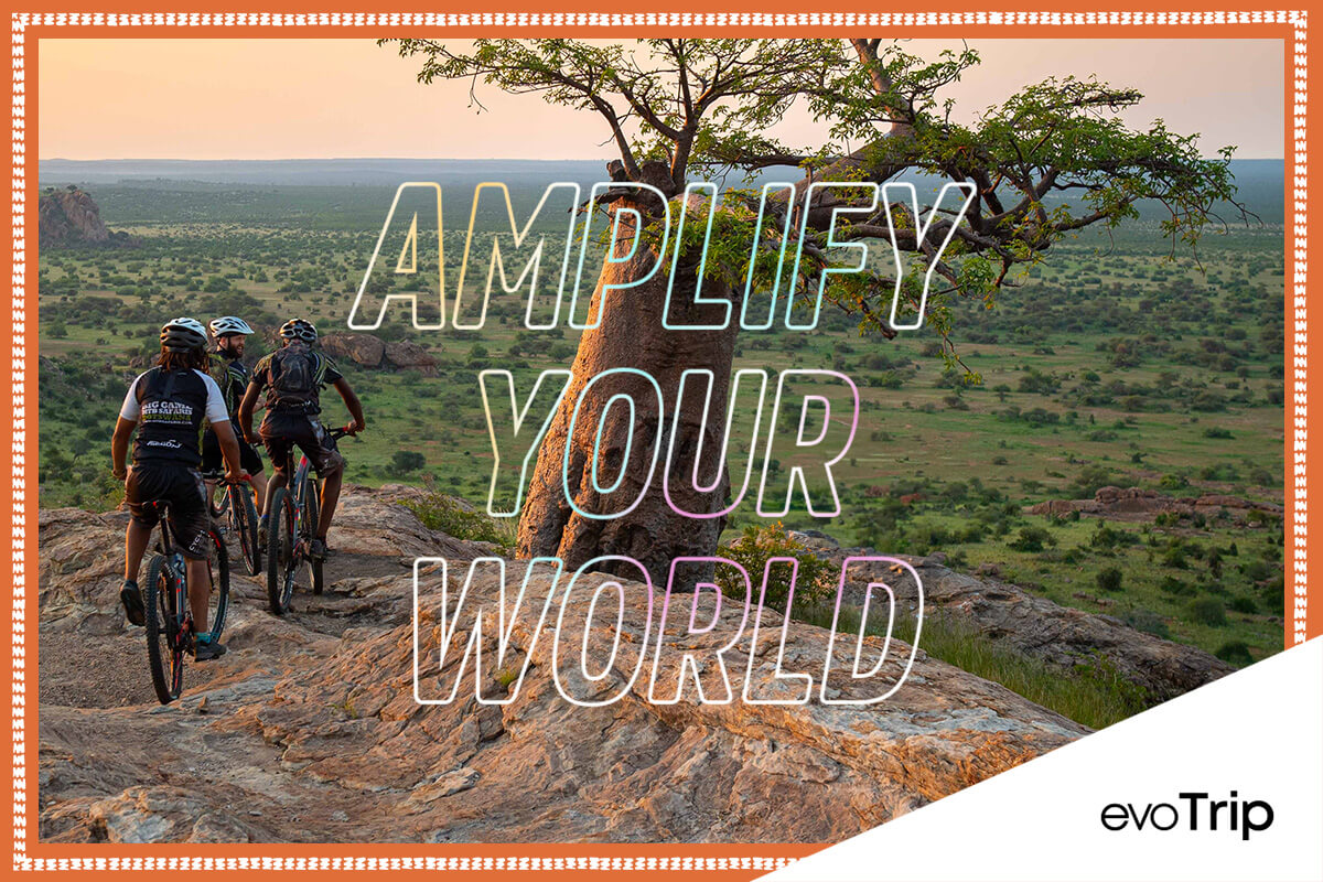
My task was to take the new brand guide and apply it across the evoTrip touch points, including web pages, emails, ads, social and print, building an asset library and process along the way. One of the main aesthetic aspects of the brand is the collage which draws from a filled passport, the myriad of colors, textures and feelings you get when traveling. I created custom stamps, maps and borders needed to build each piece. This was so fun to work on, I hope you enjoy it too.
Once all the pieces were in place, I created a ‘how-to’ guide so that any designer could jump in and use the system or add pieces as needed.
Role
Illustrator
Designer
Branded Elements
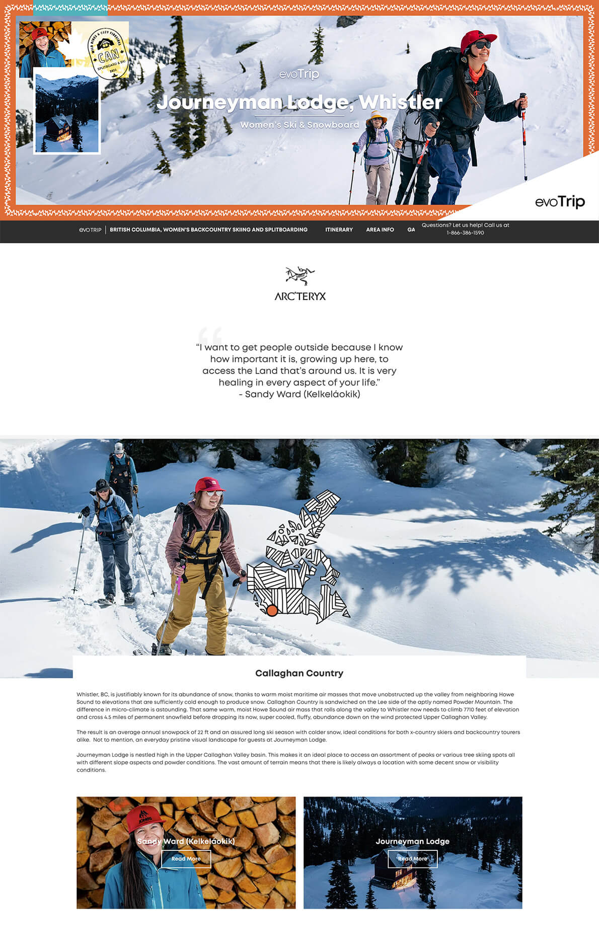

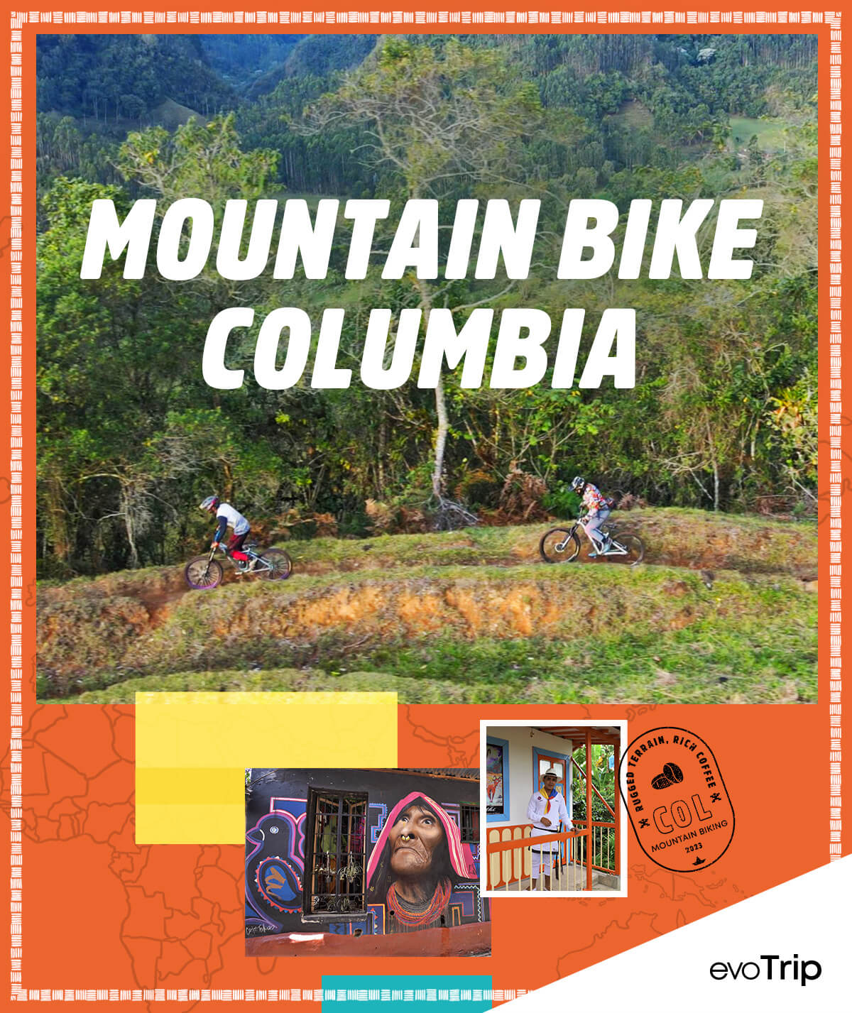

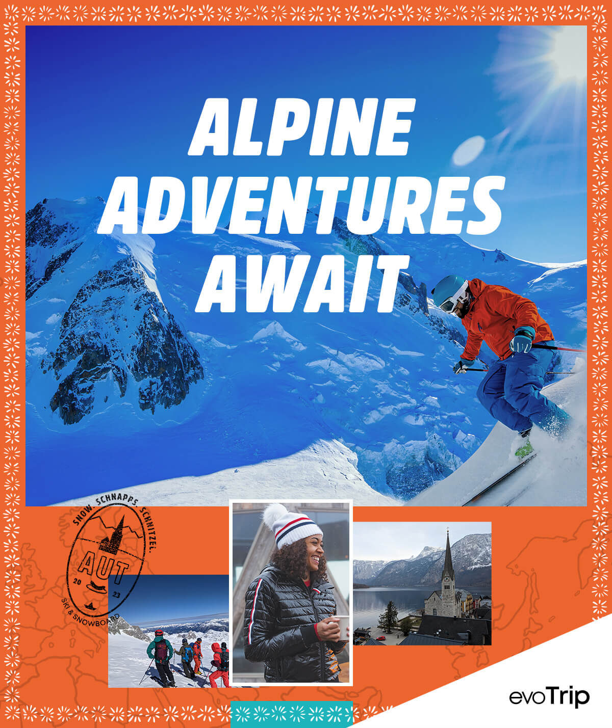



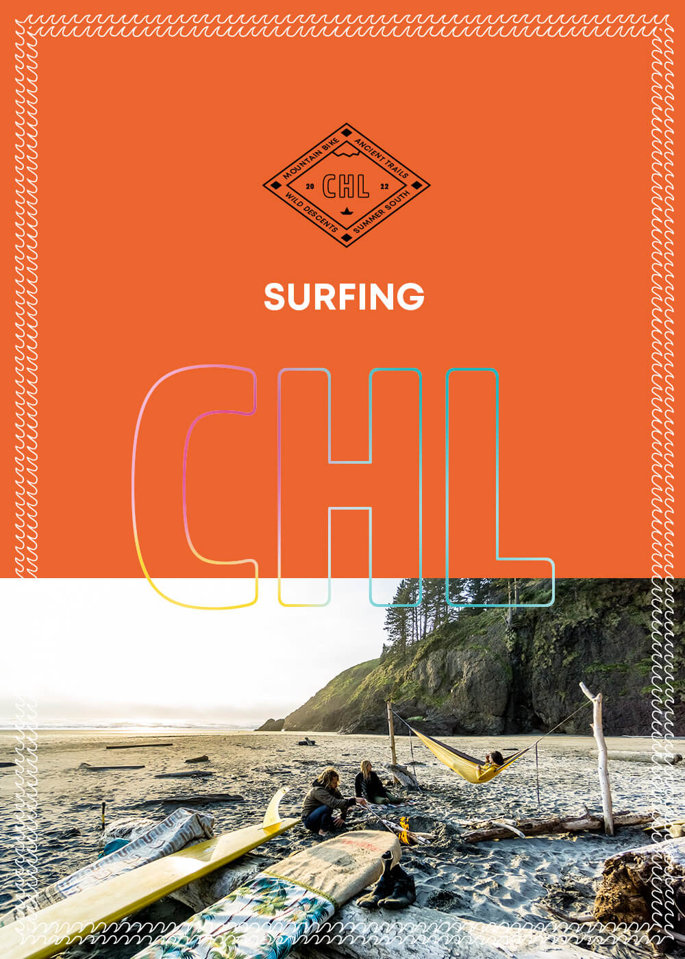

Stamps
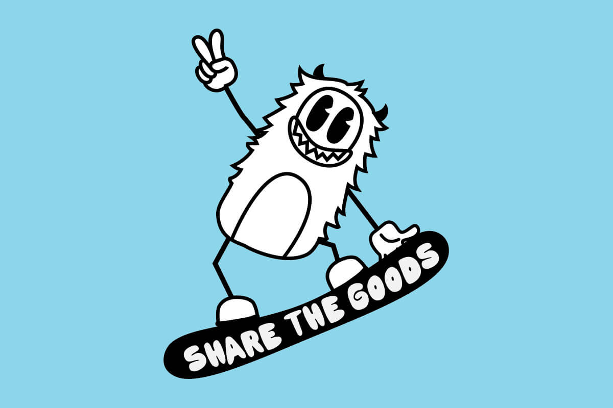
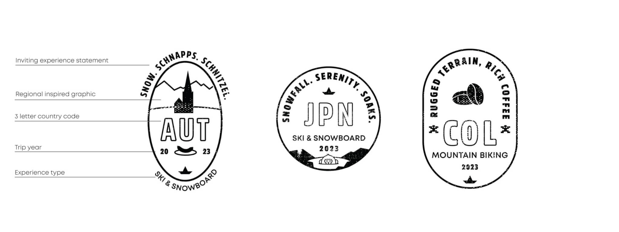
Inspired by passport stamps, these lockups are meant to be playful, experessive and versatile to capture the essence of each trip type or location.

Borders
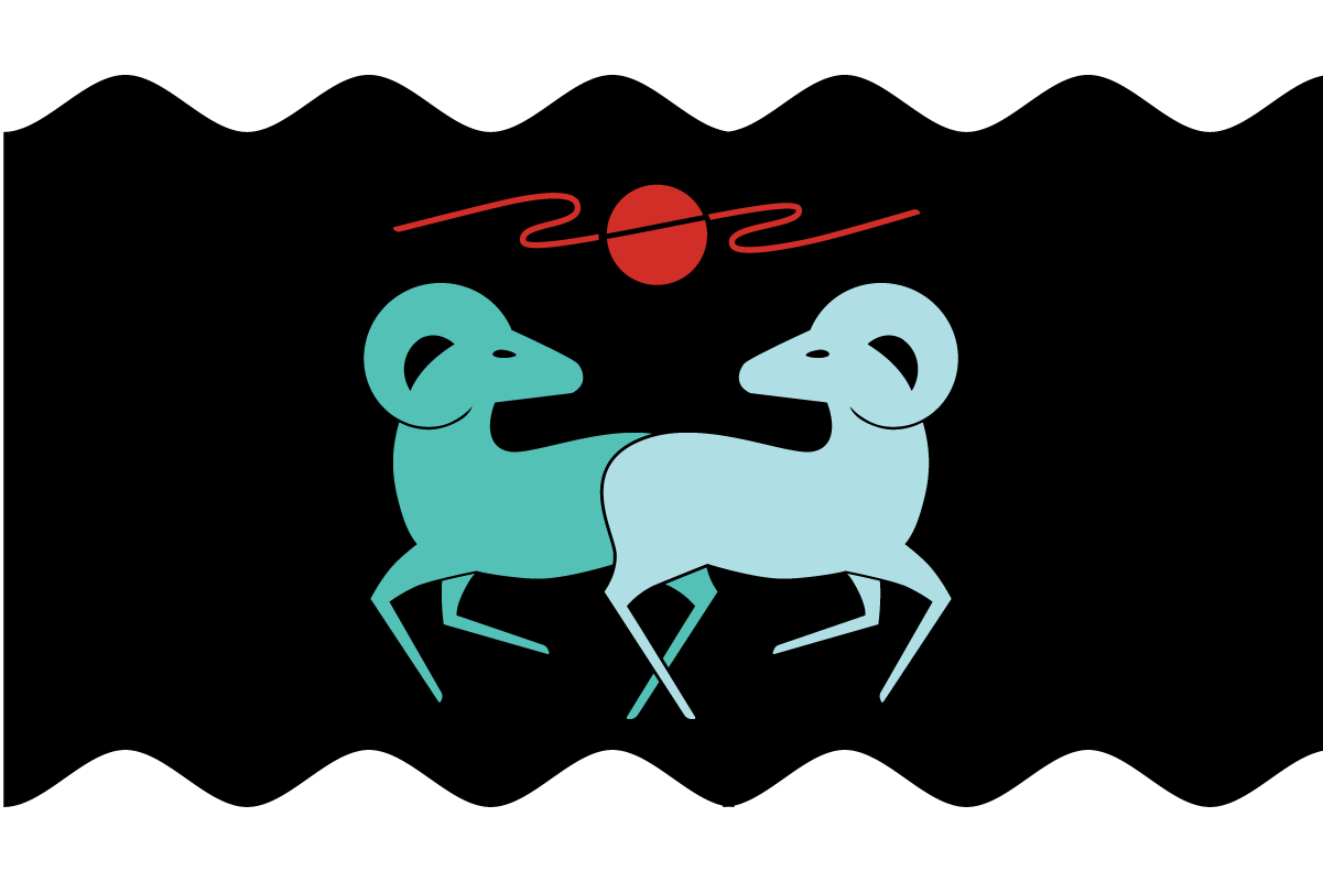
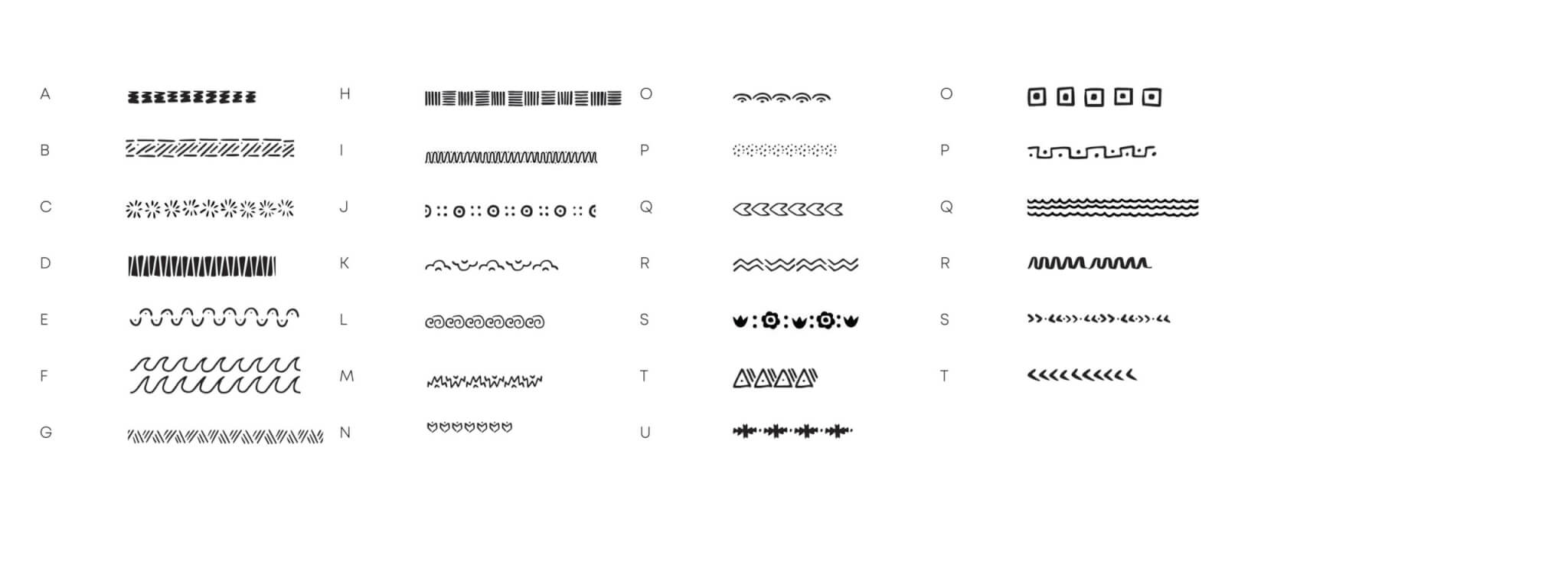
Each border is inspired by the place or trip pulling from textiles, geography and culture. They are drawn then vectorized, labeled alphabetically then stored in a library.

Maps
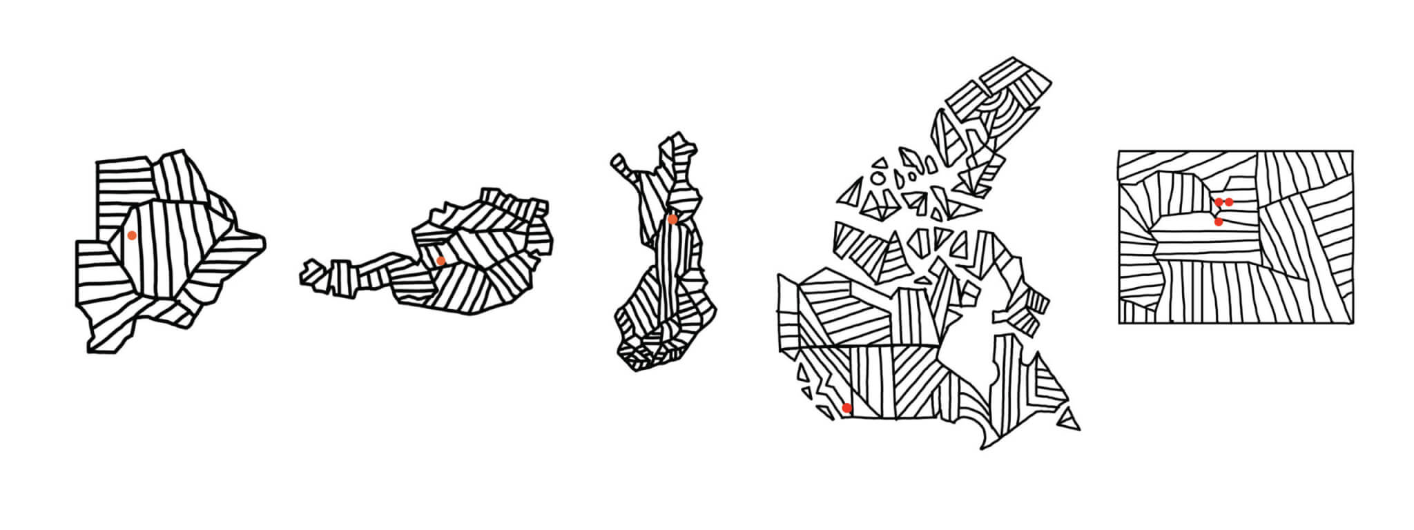
These maps are made to enhance trip pages and emails allowing users to see the country/state shape and general area they will be staying.
